|
|
Post by Stiggy on Feb 27, 2015 16:25:26 GMT
Just noticed this last night on the new channel 5 Classic car show. I wonder if anyone on here would like to do a version with the word Replicar under half a Replicar? The word does have 2 "R's" that could be made wheel shapeish. 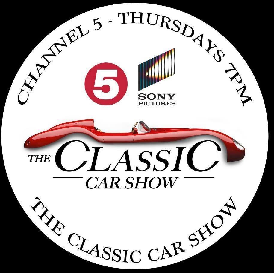 |
|
|
|
Post by johnp on Feb 28, 2015 0:24:12 GMT
Something like this? This was just grabbing a logo and a bit of text. Much more can be done with a little time spent on it.
|
|
|
|
Post by johnp on Feb 28, 2015 1:19:39 GMT
Found a better "R"
|
|
|
|
Post by Stiggy on Feb 28, 2015 9:20:32 GMT
excellent John! Perhaps the legs are a little too long on the R's and maybe the line under eplica is good.
I was thinking about a bonnet badge so it may be just an outline of the car 1/2 a car so we can supply them to Replicar owners in any colour. Many thanks for playing with it.
|
|
|
|
Post by johnp on Feb 28, 2015 13:51:56 GMT
|
|
|
|
Post by Stiggy on Feb 28, 2015 15:41:16 GMT
your are getting good at this John, I wonder if the R right legs can be shortened and moved right a bit as it looks like it is on trestles. Thanks for doing it, hope you are enjoying it.
|
|
|
|
Post by johnp on Feb 28, 2015 16:14:47 GMT
circle/oval/both? Both.   |
|
|
|
Post by Stiggy on Feb 28, 2015 17:24:36 GMT
I like the oval John, still not sure about the R legs, perhaps fatter or shorter or both? It works better with the wire wheels. Loverly job Sir
|
|
|
|
Post by johnp on Feb 28, 2015 18:37:13 GMT
|
|
|
|
Post by kiwicanfly on Mar 1, 2015 8:54:38 GMT
My Rocket spends a lot of time on "trestles"  For my two pennies worth I sway leave the long legs there and remove the wire wheels otherwise it will become an eplica if the R becomes lost. |
|
|
|
Post by mawdo81 on Mar 1, 2015 10:40:19 GMT
Why don't you Use lower case r's? Removes the trestle issue.
|
|
|
|
Post by Stiggy on Mar 1, 2015 16:49:02 GMT
good idea, lower case r's may help
|
|
|
|
Post by johnp on Mar 1, 2015 16:55:51 GMT
Why don't you Use lower case r's? Removes the trestle issue. The logo from TV with which Stuart started the thread had capital 'C's in the wheels' positions. There aren't a lot of suitable 'R's, upper or lower case available in the 200 or so fonts in the graphics programme I use - only that one in fact. If you can find another let me know the name of the font or send me a link to it. I might do a custom 'R' in the meantime. |
|
|
|
Post by Stiggy on Mar 1, 2015 17:00:18 GMT
"I might do a custom 'R' in the meantime". That's funny, get it?. I might do the same!
|
|
|
|
Post by johnp on Mar 1, 2015 17:18:16 GMT
"I might do a custom 'R' in the meantime". That's funny, get it?. I might do the same! Shame on you Mr. Mills! Here's the next instalment:  Messed with the tails  |
|


